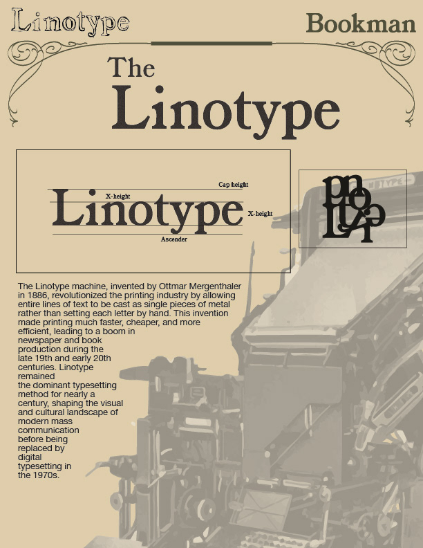
This multi-column editorial spread examines the history and influence of the Linotype machine. I paired archival photography with carefully structured text to maintain readability while giving the design an authentic historical tone. The muted color palette and typographic pairing evoke early industrial print design. By using clear typographic hierarchy and consistent spacing, I created a layout that feels educational, organized, and visually cohesive. The spread showcases my ability to handle research-based design and historical content.